Both at the Maison & Objet show in Paris and more recently at High Point Market, I had the opportunity to attend several presentations on trends in home furnishings. Trend reports are always good fun and I manage to take them both seriously and not seriously at the same time. Seriously, because I’m fascinated by the ways cultural, economic and political events influence our collective appetites for different colors and styles in our home environments. Not seriously, because it’s hard to keep a straight face when fed such nuggets of wisdom as “antlers are out” and “Caesar busts are in”.
The Maison & Objet trend seminar was actually one of the more abstract and conceptual ones I have attended in my career. Phrases such as “the transcendence of nature”, “the tension between minimalism and maximalism” and “the odor on the moon” were some notes I jotted down during the presentation. I’m not sure what those things mean in terms of home décor but they sounded like sophisticated thoughts one might sprinkle into a fancy conversation, if one wanted to sound au courant.
In this capsule space from the Maison & Objet show, a tea room is decorated with a metallic print wallpaper created using NASA space image photography.
I am going to try to break down some of the overarching trends in color and home decor that I observed in my multi-show tour through High Point and Maison & Objet this fall. I have to start by saying that the thing that surprised me most, actually, was the degree of consistency in the trends between the US and Europe. I had expected Paris to be far, far out ahead of us and didn’t really see that. It may be that in the age if Instagram and Pinterest, design ideas are making their way across the pond faster than they used to. Or maybe we are just catching up because we’ve read that book about why French women don’t get fat and we now know all their secrets.
Now Trending: Luxury
The overall theme of the Maison & Objet Show this year was Precious. Precious as in, things that are rare, valuable, or require great skill or time to make. It seems that this craving for things that are “precious” may be influenced by decreasing access to natural resources, such as fresh water, in some parts of the world. It may also be driven by our increasingly hectic and technology-driven lives, the idea of quality time with loved ones as a luxury.
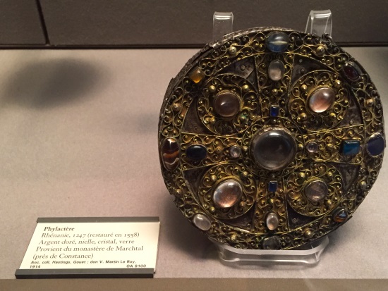
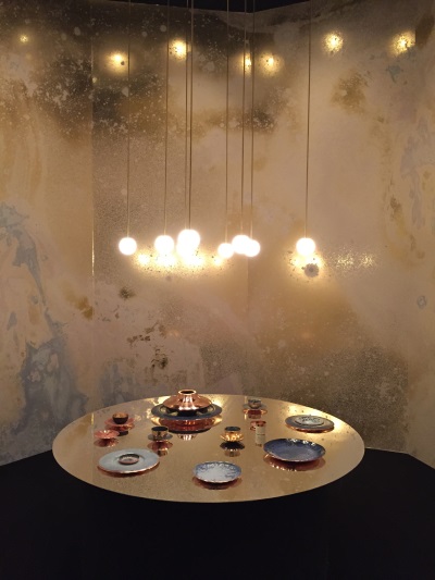
In décor terms, the precious theme translates into use of gold, semi-precious stones, marble and other minerals to embellish home furnishings. Metallics continue to be a huge trend, especially raw or natural gold. Though the jeweled box above (a “phylactere” actually) is from the Louvre’s 13th century collection, it is right on trend now. Run out and buy yours today!
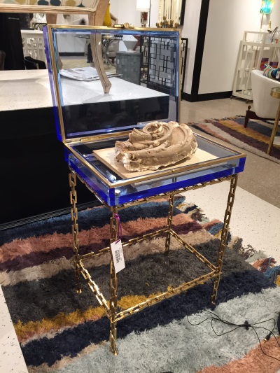
This modern trinket box (actually a side table) is the very epitome of the “precious” theme, with its gold link chain legs and gem-like blue crystal case perfect for displaying .giant mollusk fragments because, of course.
Wrapped into the luxury trend are all sorts of plush, sumptuously textured fabrics and textiles like fur (faux and real), velvet, plush knits, brocades, and even lace. Even casegoods receive the luxury treatment, like this dressing table upholstered in thick patterned velvet.
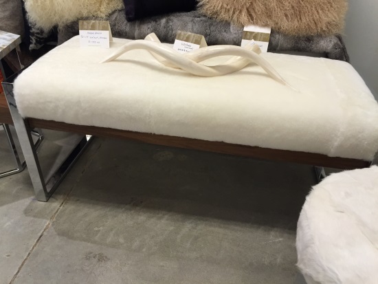
This shearling-wrapped bench seen at High Point plays right into the ongoing trend for luxury hides in décor. But forget about those antlers! So passé. Oh, wait, I think those are horns, I’ll allow ’em.
Also Trending: The Decorative Arts
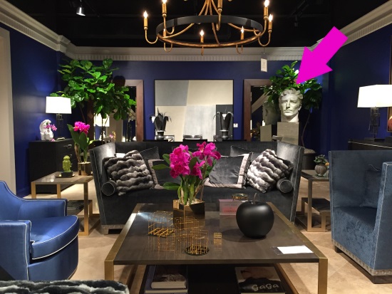
I guess this is where the Caesar busts come in (note Chaddock’s showroom above). There has been a resurgence of interest in the decorative arts, and we’re seeing a return of ornamental details inspired by Greek Classicism to Art Deco and everything in between. In general I think there’s a slight fatigue with the mid-century modern mania of the past decade. So long, Don Draper. It doesn’t really mean mid-century goes away entirely, but maybe becomes a less prominent feature within an overall collected mix.
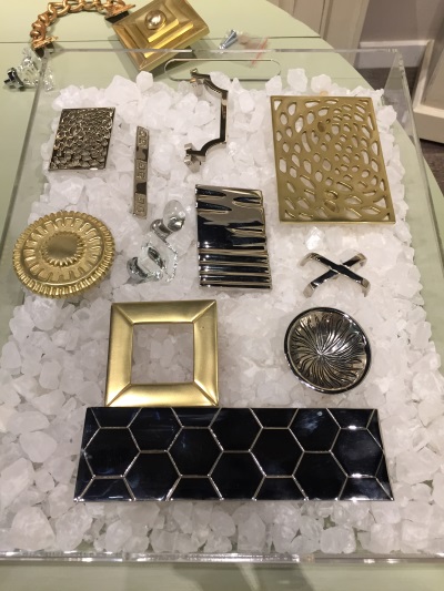
When I talk about decorative arts as a trend, what I really mean is pattern, detailing, trim, ornamentation, or, frou-frou, to use an industry technical term. It’s all the stuff the modernists tried to do away with in the first half of the 20th century when architects started building glass box houses with like, one chair inside, if they were feeling generous. Today’s look is collected, with carefully considered layers of ornamentation. It’s not over-the-top fussiness, but rather about creating a tension between minimalism and maximalism (see how I did that? This blog just got FANCY.) The photo above is like a jewelry box filled with decorative handles for cabinets by Tritter Feefer.
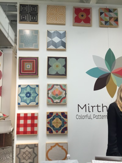
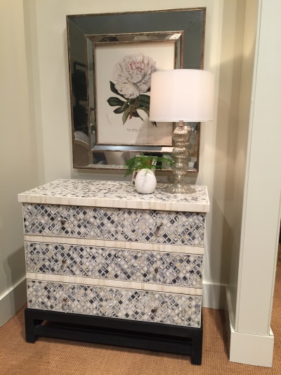
Pattern, color, and ornamentation becomes a key design feature in interiors, and you see it popping up in so many different ways, from these fun and colorful wood floor tiles from Mirth (top photo above), to the bone inlaid chest (second photo) from Harden.
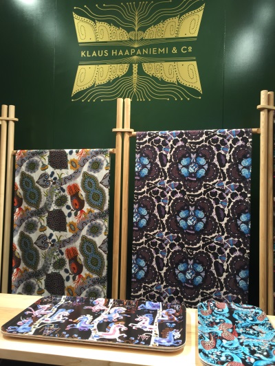
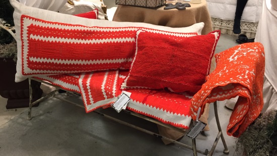
The decorative arts trend looks to cultural as well as historical sources for inspiration. The folk arts of eastern Europe, Scandinavia and the far east are reflected in patterns and motifs, particularly in textiles. The top photo above shows folk-lore inspired prints designed by Finnish designer Klaus Haapeniemi, who has also done extensive work for Finnish tableware company Iittala that I absolutely adore. Below that are beautiful red vintage embroidered linens from Hungary. Embroidery and needlepoint (both vintage and contemporary) are another area of the decorative arts that has seen renewed interest.
Some Thoughts on Color Trends
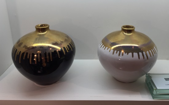
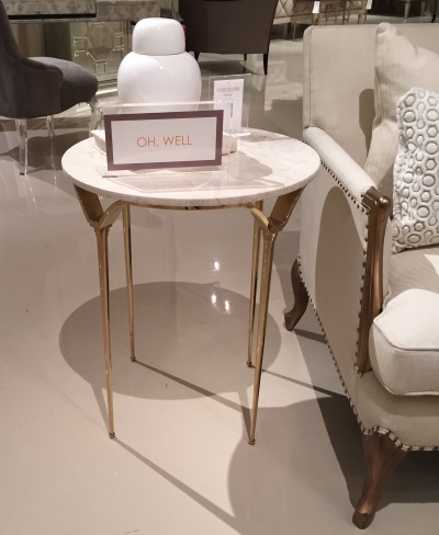
Really color needs its very own blog post but let me summarize here: Gold. Gold, gold, gold, gold, gold. Are you sick of gold yet? Cause we are juuuuust getting started. I realize gold is a metallic but there is always going to be something metal in any room, whether it’s a lamp, faucet, knob or what-not. I went looking for a nickel lamp the other day and was hard-pressed to find one, that’s how far the golden pendulum has swung. By gold of course, I mean anything gold-toned, which might include brass, bronze, or rose-gold or even copper. Gold paired with black (like the vase from Eur Decor above) and gold paired with marble (like the second photo showing a side table from Caracole) are particularly on-point trend-wise.
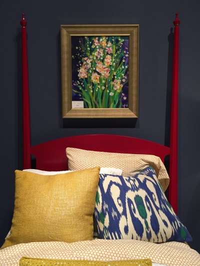
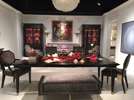
One major distinction in color trends between Europe and the US was I noted a lot more deep, saturated colors and jewel-tones in the US market. I saw vivid lacquer red like in the four poster bed from Harden above, sapphire blue, coral, emerald and fuchsia. On the neutral side, these colors are balanced out by strong black and white as seen at Chaddock (second photo above), and a continued emphasis on grey.
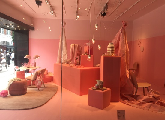
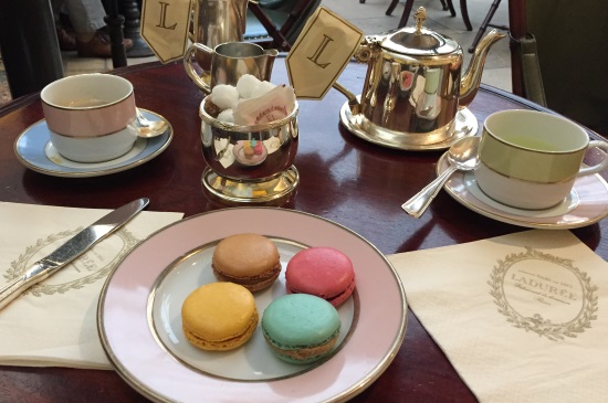
On the other hand, I saw a lot more muted colors, natural neutrals, and macaron-hued pastels in Europe. And lots of pink. Although it could be mistaken for Barbie’s Dreamhouse, the above photo is actually a store window in Copenhagen. I saw a lot of this particular shade of pink in Paris as well, and won’t be surprised to see it headed our way soon.
So there you have it, my world-tour of trends. I’m brewing my afternoon coffee and it smells heavenly, like the odor on the moon.
——–
Tamara Leicester is a licensed interior designer and owner of Tamara Heather Interior Design, LLC. She designs casually elegant interiors with an artistic sensibility, often drawing upon the talent of local artists and craftspeople in her work. Dreaming about updating your space? Learn more at tamaraheatherinteriors.com.