 So you finally picked a paint color you absolutely adore, and you’re excited to get that color up on the walls. Not so fast! Achieving professional looking results requires more than getting the wall color right. Read on for the four painting no-nos I see most often in homes, and tips for how to avoid them.
1. Stopping Paint on an Outside Corner
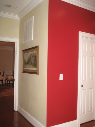
There are many things wrong with this picture, but the biggest is the red paint color that stops on an outside corner of this kitchen. This one would be an easy fix – just continue that red around the corner and stop it at the inside corner where the door frame meets the wall.
This is my biggest paint-peeve. I think it looks really tacky, and I’ll try to explain here why: walls are three-dimensional objects. When the paint stops on an outside corner, it’s almost as if the wall is treated as a surface and not a supporting structure. And the visible juncture where the colors transition is jarring, particularly when the contrast in colors is dramatic. Here’s what to do instead: continue the color until you reach an inside corner. If you live in one of those houses that’s trim-less and open-plan without logical stopping points for paint, then sorry honey, I’m going to advise you pick one color and stick with it. You can always paint a singular accent wall for contrast and color, or play up color with your furniture or accessories.
2. Neglecting to Coordinate Walls with Trim
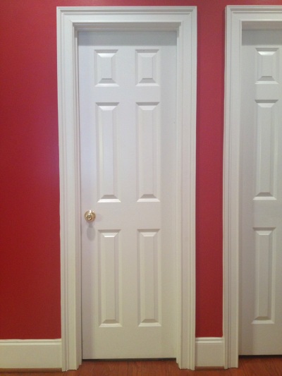
There’s that red again! While there are few circumstances where this shade of shiny cherry red would work (fire station?), the wall color is further blighted by trim the color of Xerox paper. It looks like a cheap Valentine. A creamy off-white or even a deep espresso brown would go miles towards making this red work.
Painting trim is a pain in the you-know-what. Believe me, I know, because when I was fourteen I painted all of my bedroom trim including baseboard and window frames, magenta. Ugh, that is a painting no-no for another post. Anyway, consider it a meditative exercise (or hire someone else to do it) because to really show off your new wall color, the trim needs to coordinate. That doesn’t mean it can’t be white. But the builder’s grade white that came with the home really doesn’t look good with anything except builder’s grade white walls. ESPECIALLY if you’re painting your walls a deep or dark color, the trim should have an undertone that works with the wall. It can be in the white family, but it’s going to be some form of off-white. The rule of thumb is to pair warm colors with warm whites, and cool colors with cool whites. Alternatively, consider painting the trim a dark, contrasting color such as espresso or black to create a feeling of richness and drama.
3. Forgetting to Paint the Ceiling
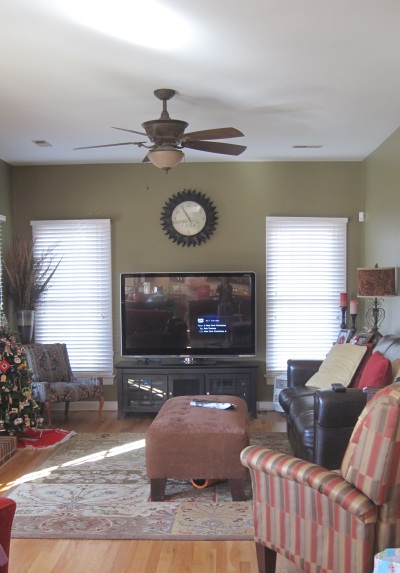
I love the wall color, but the white ceiling makes this room seem unfinished. Since this is a client space where I was called in to do a color consult, I recommended they paint the ceiling Sherwin Williams Rice Grain – a very pale gold with a hint of green. The color will nicely coordinate with the walls and tie-in colors from the adjacent room.
The ceiling makes up about 1/6th of the room. It’s a blank canvas ripe for exploiting. Again, I implore you not to settle for the builder’s grade white the ceiling came with. Similar to your trim, choose an off-white (or a neutral, or a color) that coordinates well with the walls. I love to paint the ceiling a contrasting color (and I do mean COLOR) from the walls for a fun and contemporary look. Painting the ceiling the same color as the walls is also a great way to go, especially if there is no crown molding, because it makes the room appear seamless and expansive – great for making smaller spaces seem larger!
4. Allowing Plastic Outlet Covers to Cheapen Your Beautiful Walls
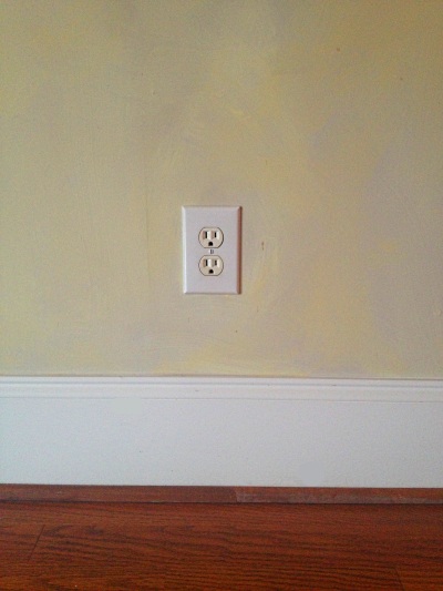
Here we have a plastic outlet cover that that stands out like an unsightly blemish on this faux finished wall. Granted, it’s not a great faux-finishing job either.
There’s nothing worse than seeing a beautifully decorated home, resplendent in rich color, sumptuous drapery and fine furniture, marred by flimsy brite-white plastic outlet covers. It’s like wearing white gym socks with a business suit. Outlet and switch covers now come in a dazzling variety of colors and materials. Stop by the electrical aisle at your local Home Improvement store and you’ll find many choices, guaranteed to mesmerize you for a full twenty minutes (is that just me?) I recommend choosing a color/material sympathetic to the surface it will go on. It doesn’t have to match – the idea is to choose a cover that will visually blend or recede as much as possible. On warm white walls, you may get away with ivory plastic covers.For a budget-friendly option, use leftover paint from your walls to paint your outlets and switchplate covers to match. On a faux-finished or wallpapered wall, I recommend using the same paint technique or wall paper to cover the outlets, so that the pattern appears un-interrupted. And, in a room with lots and lots of outlets and switchplates, just start with the most visible ones. I’m in the process of painting and replacing the ones in my home myself!
Feeling a little bewildered by color? Give me a call and I’ll be glad to assist with your selections and help ensure you get it right the first time!
———-
Tamara Leicester is a licensed interior designer and owner of Tamara Heather Interior Design, LLC. She designs casually elegant interiors with an artistic sensibility, often drawing upon the talent of local artists and craftspeople in her work. Dreaming about updating your space? Learn more at tamaraheatherinteriors.com.