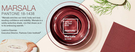
Worldwide color authority Pantone (yes, that IS a real thing), recently announced the 2015 color of the year: Marsala. As the name suggests, Marsala is a red wine hue, sort of a faded burgundy. Pantone is trying to play up the French, foodie, oenophile associations with Marsala.
Sexy yet tasteful: Marsala. According to Pantone, anyway. Images via pantone.com.
But from what I have read in the blogosphere, reception to the color has been mixed. I will admit that I fall squarely in the not-a-fan camp. To me Marsala is the color of OLD, STODGY, PRISSY, and CORPORATE APPROVED. Give me dusty leather-bound law books, Victorian bed and breakfast bedskirts, hotel conference center carpets, and I give you Marsala:
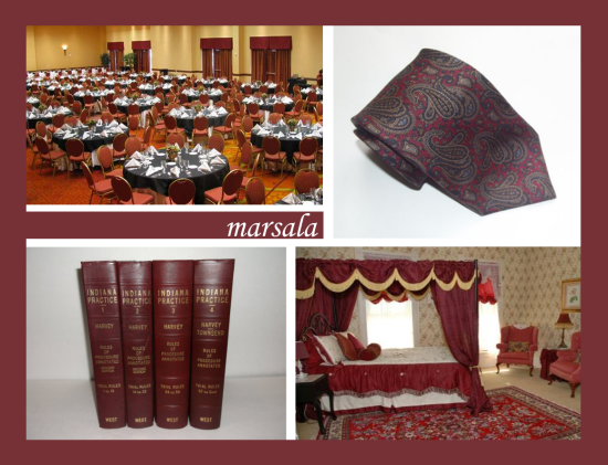
Here’s my take on the color inspirations for Marsala. ACTUAL hotel conference center, leather law books, bed & breakfast, plus a vintage 1980’s paisley tie.
A few years back I blogged about 2013’s Emerald, noting it was a worrisome choice. Not because I dislike Emerald, but because I was concerned it signaled the coming resurrection of other 1980’s colors. My distaste for Marsala probably has a lot to do with having endured it throughout childhood. I just cannot stomach those dullish pinky-purple hues everyone was wild about in the 80’s, especially Laura Ashley but also the Golden Girls.
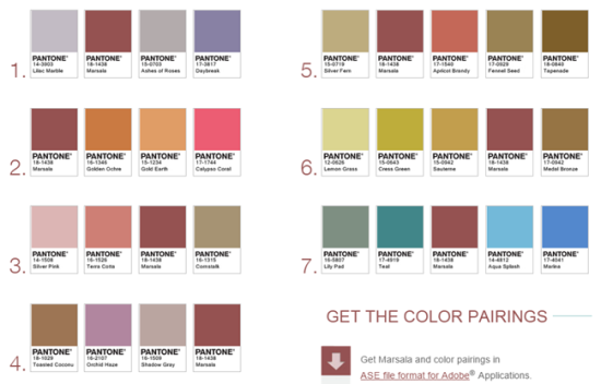
Marsala color palettes. Image via pantone.com.
In the chart above, Pantone suggests a range of different color palettes that work with Marsala, with a heavy reliance on pink and lavender. All of these colors appear to have arrived via the DeLorean time travel machine from Back to the Future. (Coincidentally, in the second Back to the Future movie, they travel to 2015 from 1985. How fun to watch that movie again and see how much they got right/wrong about the future!) To prove my point, I dug up some classic 1980’s images:
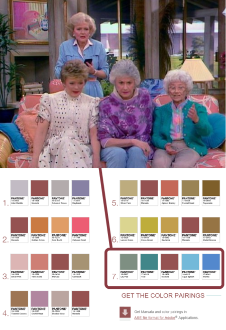
Exhibit A: The Golden Girls. Pantone suggests pairing turquoise with Marsala, for extra 80’s flair that only septuagenarians living in Miami could love. Images via tvland and pantone.
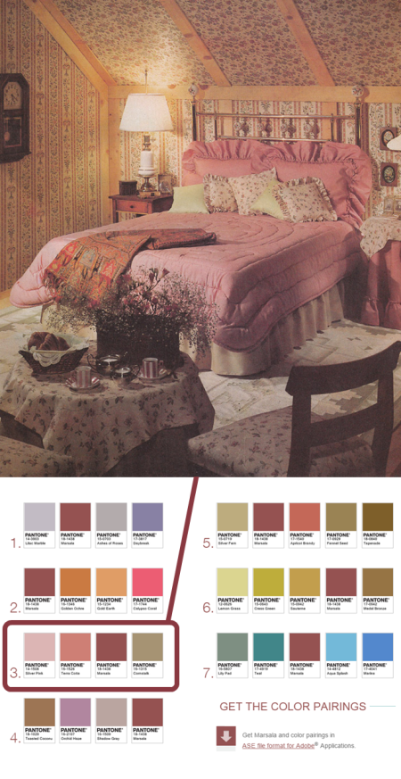
Exhibit B: A Laura Ashley-inspired bedroom ca. 1987. Images via huffingtonpost and pantone.
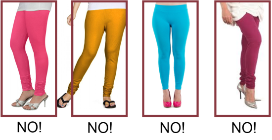
I think whatever generation you were born into, there may be certain colors associated with that era that you now find completely nauseating. If you came of age in the 60’s or 70’s, perhaps it’s avocado or harvest gold. If you’re a millennial, maybe it’s purple or beige? I’m not sure, but I’d be curious to hear from some millennials on the topic. For me the color I just can’t do again is burgundy/mauve/marsala/whatever you call it. As they say in fashion, if you’re old enough to have worn it the first time, you’re too old to wear it again. Case in point: spandex leggings worn as pants. To quote an 80’s mantra: just say no.
In addition to marsala, some other colors I’m not psyched to see return include hot pink, mustard, and electric turquoise.
So now that I have released my antipathy for Marsala, I thought I should really be trying to use this blog for good, not whining. I decided to look for a silver lining to the situation and see if I could find some fresh ways to employ Marsala in a contemporary interior. After all, one thing I always tell my clients is, there are no bad colors, only bad color combinations. I looked to Houzz for inspiration, and I did find a few palatable palettes that included some amount of Marsala.
1. In small doses as a pop of color against a neutral backdrop:
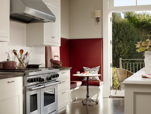
With lots of white around it, Marsala manages to look fresh and indeed appetizing in this kitchen, staying on point with its wine-themed name.
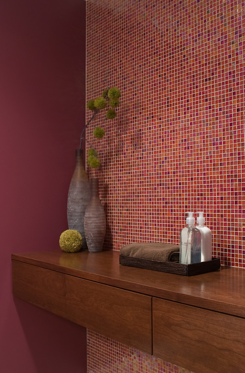
2. In an analogous color scheme with red and orange:
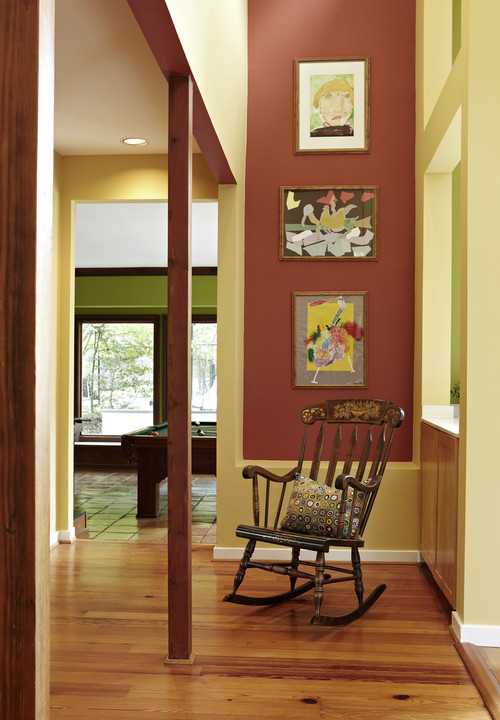
3. In a complementary scheme with vibrant green:
The deep jade green and bright white trim make this traditional interior feel a bit preppy and very modern.
4. In a folk-art inspired palette of butter-yellow and leaf green:
The colors in this bright, yet cozy space feel like they came out of a patchwork quilt, and make the Marsala wall seem more artsy than fartsy. (And the wonderful children’s art is a nice touch!)
So, ok. I definitely see some potential for Marsala, just not in the color palettes that Pantone suggests. Still, I think I prefer my Marsala to be of the alcoholic variety. More wine, less whine. What do you think?
Happy new year!
——
Tamara Leicester is a licensed interior designer and owner of Tamara Heather Interior Design, LLC. She designs casually elegant interiors with an artistic sensibility, often drawing upon the talent of local artists and craftspeople in her work. Dreaming about updating your space? Learn more at tamaraheatherinteriors.com.